The brief we set ourselves
Design the launch site for a serious financial product: the kind of tool that wins on depth but loses on first impressions. The site has to convince two audiences at once: the operator who will live in the dashboards, and the buyer who signs off on the contract without ever opening one.
The before-state this answers
Almost every early fintech site makes the same trade: screenshots do all the talking. The product shots are real, the feature list is accurate, and the overall effect is an internal tool with a pricing page. Nothing frames the outcome, so the visitor does the positioning work themselves, and visitors never do the work.
Direction
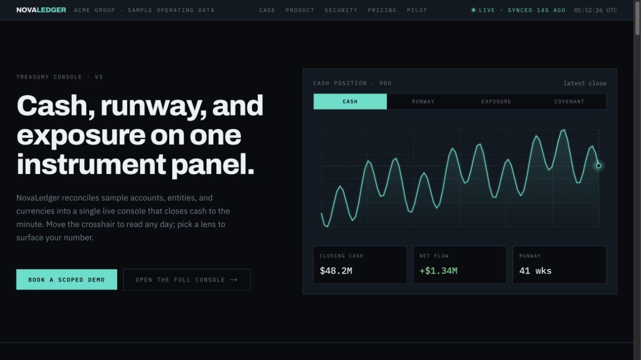
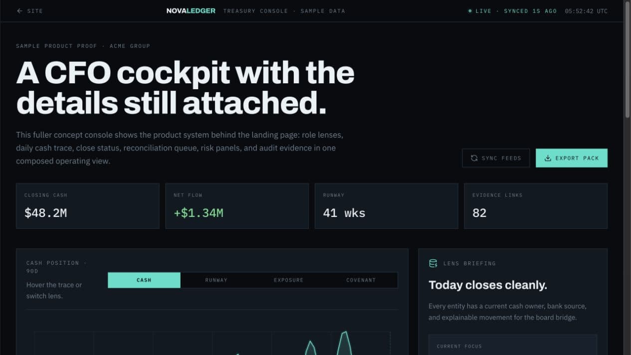
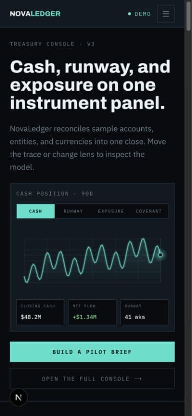
An instrument panel, not a brochure. Midnight graphite surfaces, one disciplined accent per data state, and typography that behaves like a well-designed terminal: dense, aligned, calm. The interface itself becomes the brand, because every module on the page is shaped like the product's own components, so by the time the visitor reaches the demo CTA they already feel like a user.
Motion language
Precision over spectacle. Charts draw in with short, decisive eases of 150 to 200 milliseconds, no bounce, no float. Numbers count up exactly once, on first view. The restraint is the message: this is software that respects your attention, built by people who respect your time.
Conversion structure
The page answers the money questions in order: what it does, who runs on it, what it replaces, what it costs to start. From there it routes intent two ways: operators get an interactive product tour, buyers get a demo call with a qualifying question baked into the booking. Proof sits before every ask.
What this demonstrates
How PixelSunset makes dense products feel launch-ready: identity, interface, and motion working as one system, with the conversion path designed at the same time as the visuals, not bolted on after. That strategy-to-launch system is the core of an Orbit Build.