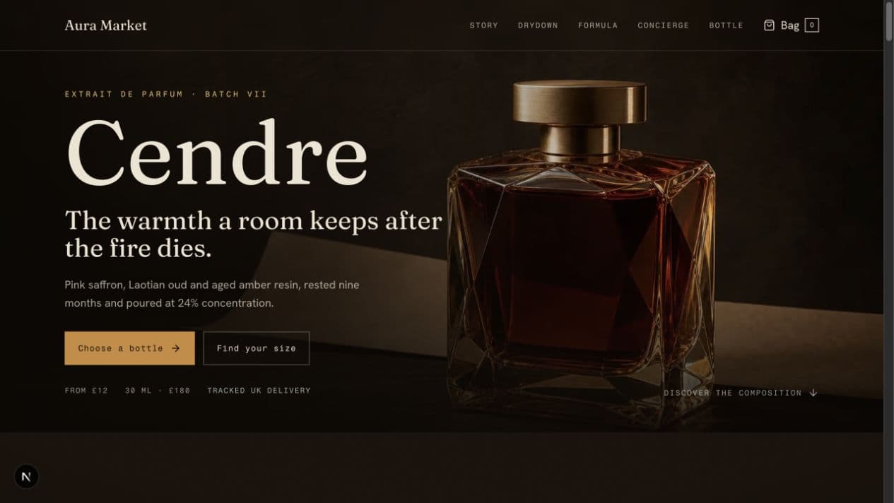
The brief we set ourselves
Design a storefront for a premium physical product, the kind with real craftsmanship behind it, where the product page has to justify a price the marketplace listings can't.
The before-state this answers
Boutique brands routinely ship beautiful photography into template stores. The grid is tidy, the fonts are safe, and the product that took years to perfect gets the same visual treatment as a phone case. Price resistance follows, because nothing on the page explains why this costs more.
Direction
Editorial pacing. The product page opens like a magazine feature, with one hero frame, generous negative space, and warm light against deep graphite. Then it tightens into commerce: materials, dimensions, care, shipping, returns, each answered exactly where hesitation happens. Photography leads, interface recedes, and the warmth of the palette does the brand's talking.
Motion language
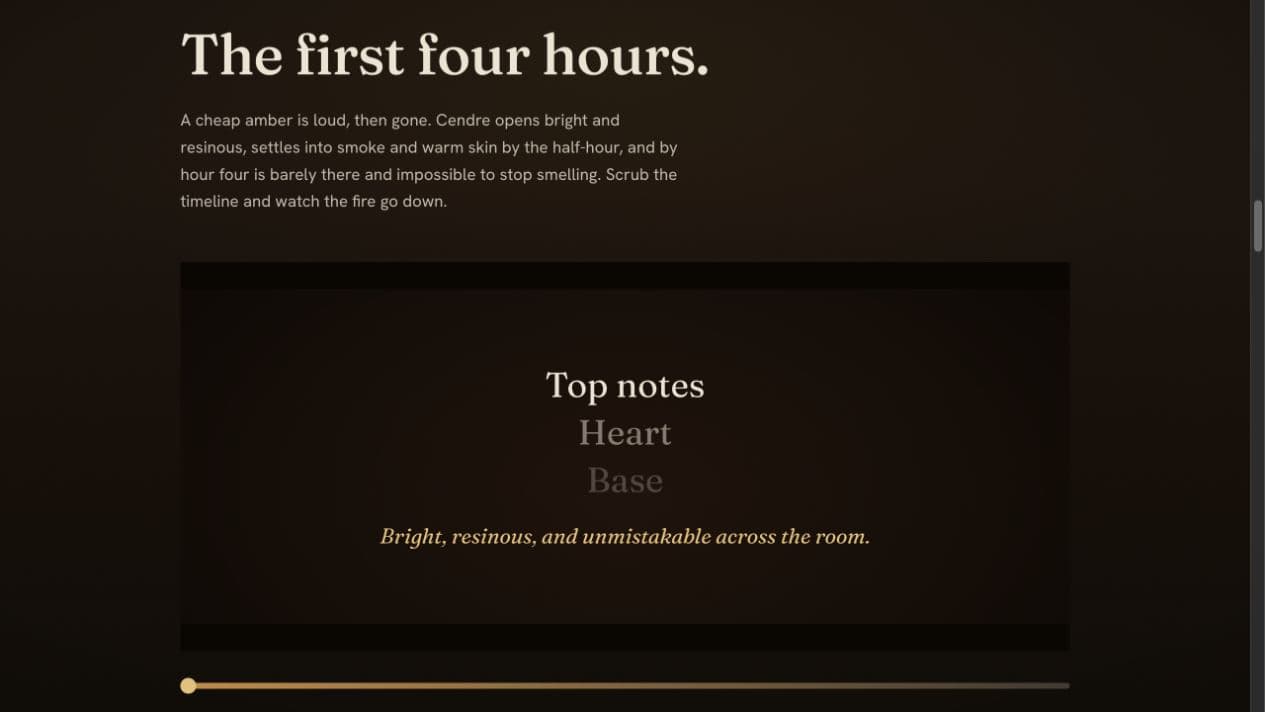
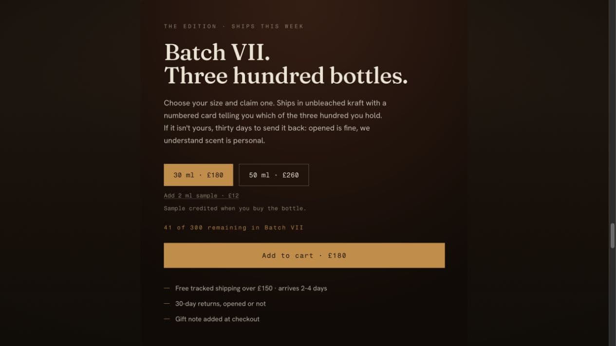
Slow reveals tied to scroll: the product turns, details bloom, light moves across surfaces the way it would in your hands. Motion never touches the buy box: the cart, price, and options stay still and instant, because cinema belongs to desire, not to checkout.
Conversion structure
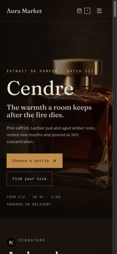
Above the fold: what it is, why it's different, what it costs, and the add to cart. No scavenger hunt. Trust accumulates down the page in the order buyers actually worry: quality proof, then logistics, then recourse. Every scroll depth has its own reason to act.
What this demonstrates
How PixelSunset separates theater from transaction: cinematic storytelling where it builds desire, and absolute clarity where money changes hands. It is the commerce expression of a custom Orbit Build.